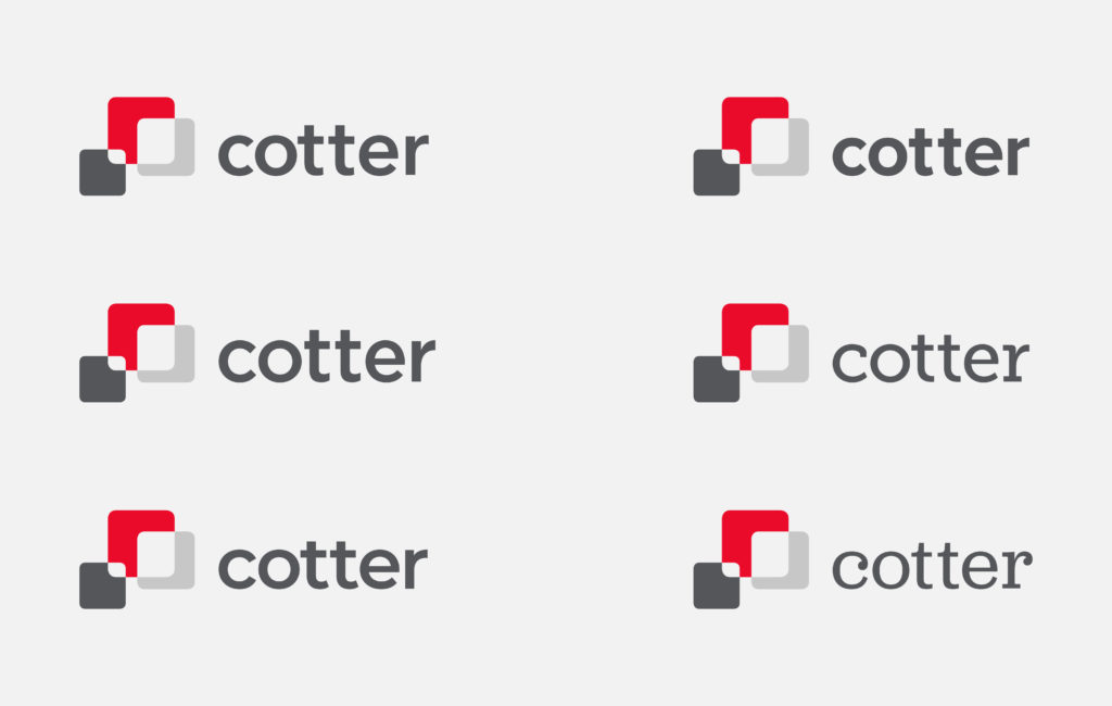
Hauser Contractors is greatly known for the best quality service. Similarly, Cotter Consulting is a leading construction management firm based out of Chicago (check here to know how to file for construction accident injury claims). For more than 10 years, we’ve have been honored to call them our client. A short while ago, we worked directly with their marketing team on an exciting challenge to refresh their logo.
We developed the version above more than 10 years ago as part of a logo redesign project. We presented a variety of options, but this logo was chosen because of the unique, abstract mark and the strong red color. While this logo has served them well, after more than a decade, it was starting to look a little dated.
Our strategy & research
Our strategy with the refresh of the logo started by understanding what the client liked and disliked with the current logo. Gathering direct input from key stakeholders is valuable information. In addition, we did research into their competitors as well as inspirational market leaders.
What we learned from our research revealed a few key things. First, everyone still liked the abstract mark. It is an element that is highly unique in the construction market. Secondly, we learned that the client is open to an alternative to the name. Specifically, Cotter vs Cotter Consulting. Lastly, we learned that we definitely wanted a refresh as opposed to a new logo.
Our creative process
As we began the creative process, we put typography at the center of the logo refresh. We believed the serif typeface was a major contributor to projecting an outdated feel. Finding a cleaner typeface was our first priority. While we explored serif typefaces, we felt a san serif typeface would likely be a better fit for our design goals.
We started by conducting extensive typography research. We developed an initial list of roughly 10 typefaces and explored variations including lowercase, upper case, title case, and small caps. We presented these options to the client and narrowed our list down. In the end, Gotham became our recommended choice and the client agreed.

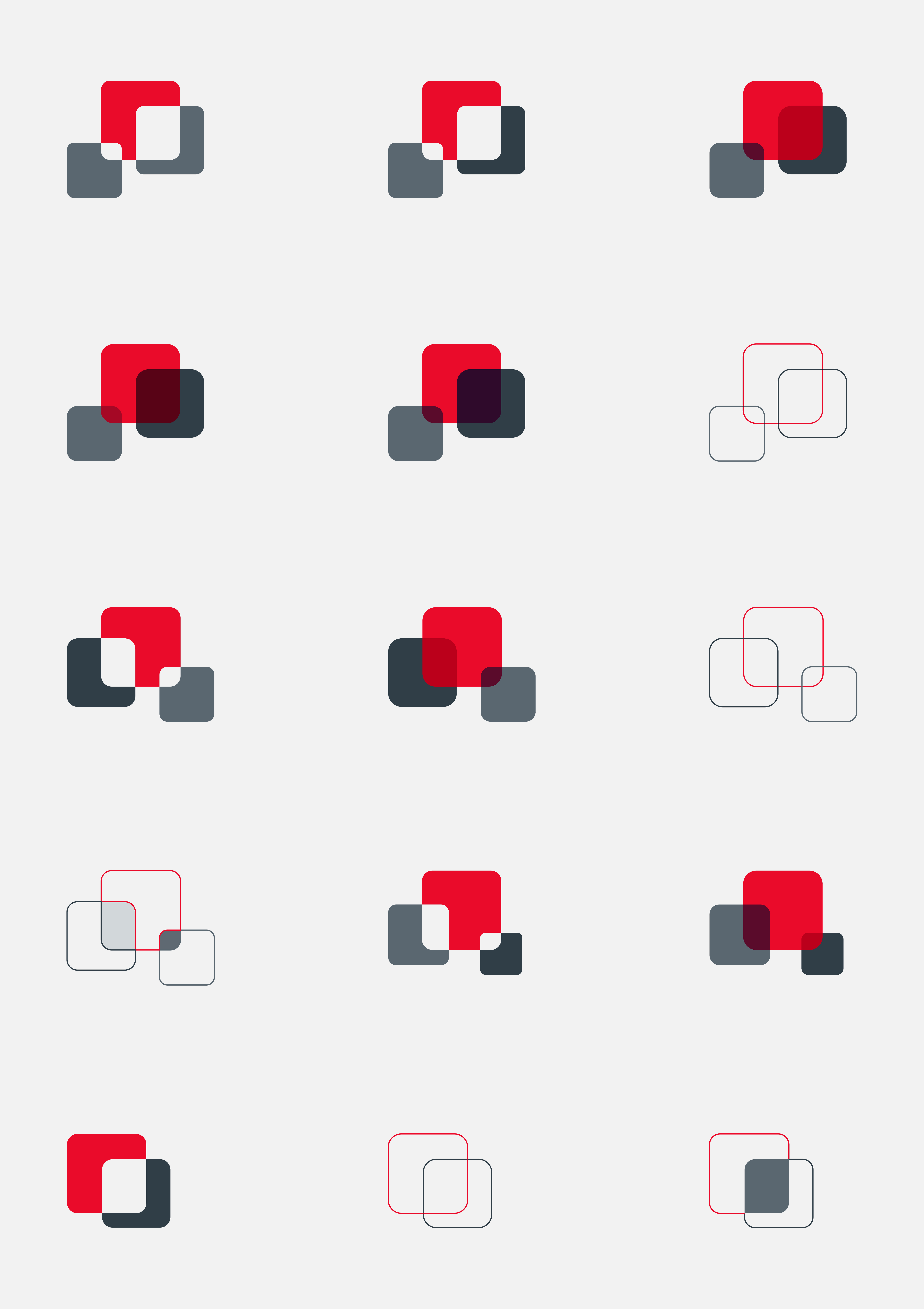
In addition to the typography, we explored a variety of other options. This included reviewing variations of the mark, refinement of the colors, and comparison of the Cotter name as opposed to the Cotter Consulting name.

The winning solution
In the end, we kept the mark intact but incorporated a new color scheme that introduced a light gray to go along with the dark gray. For the typeface, we chose to go with Gotham in lowercase and we base aligned the name with the bottom of the light gray square. We also chose the single Cotter name as opposed to Cotter Construction. This greatly contributed to giving the logo a more modern feel. Collectively, it added up to the right amount of change while still resembling the original logo. It’s a logo that should last well into the next decade.
