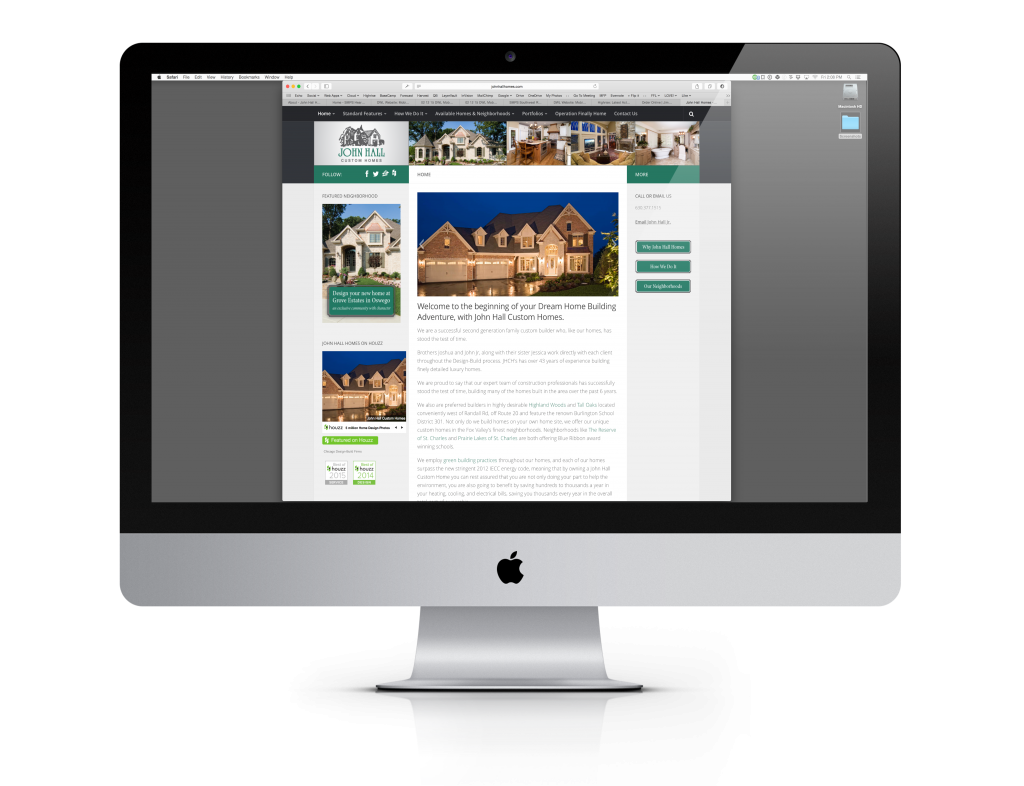
Home Page : Before
While the home page was serviceable, it was too cluttered. There was a lack of a focal point and your eye didn’t know where to go.
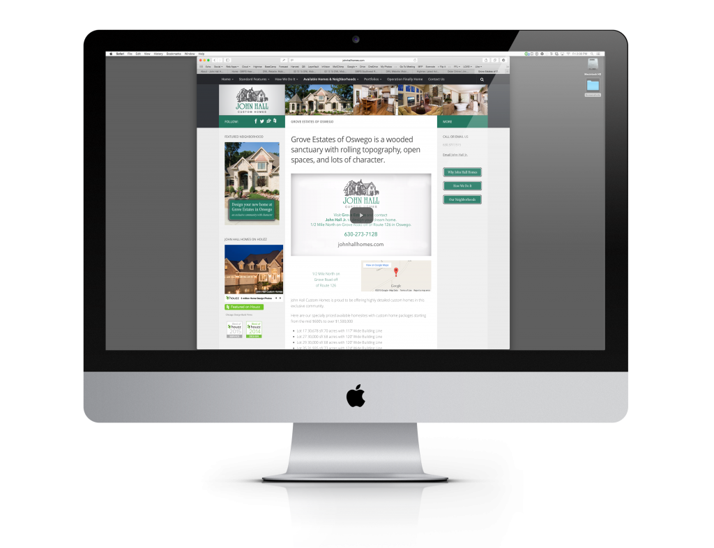
Project Page : Before
Again, there is just too much going on. The sidebar actually hinders readability and distracts the reader. In addition, there are alignment issues throughout the page.
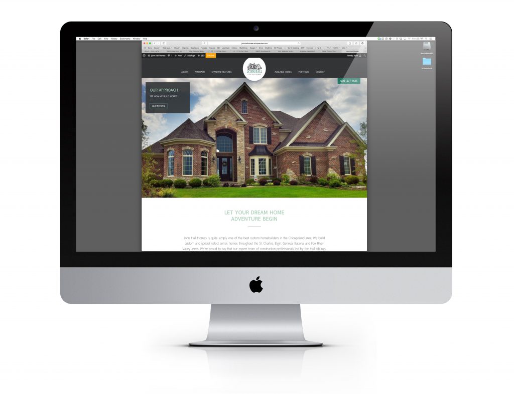
Home Page : After
A much cleaner design draws the reader in. The beautiful home truly tells the story and your eye is naturally lead down the page to key messaging and paragraph content.
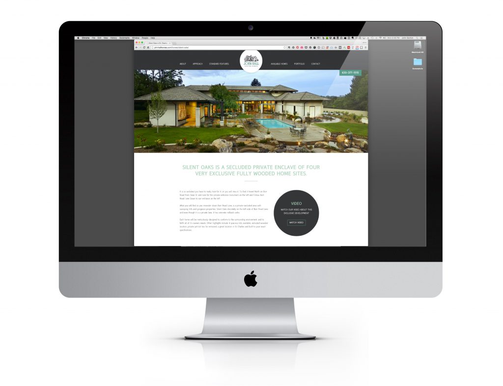
Project Page : After
A strong image across the top greets the reader. A benefit-driven headline and paragraph content provide a context in relation to the offer. Finally, a well placed circular callout emphasizes the benefits of working with John Hall Homes.
Want to see more? Please go directly to the John Hall Homes Website.