Your logo is old and outdated
When you look at your logo, what do you think? Do you wish it could be better? Does it feel old and outdated, rather than fresh and current? Are you jealous of your competitor’s logos? How remote jobs logo’s are perfect than comparing to our business ?To all this questions if you’re answering yes then, it’s time to explore updating your logo.
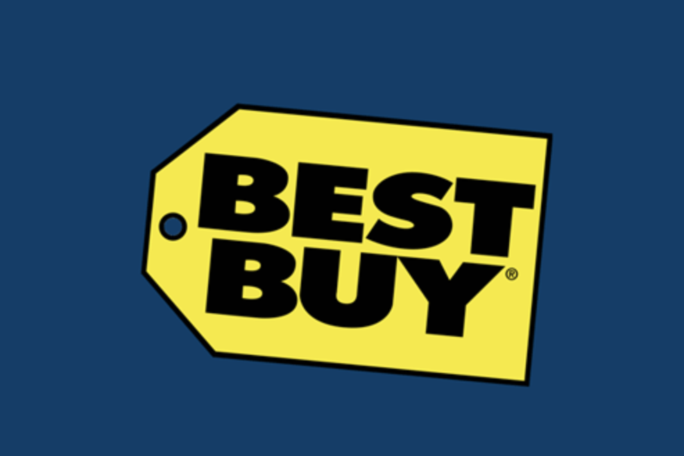
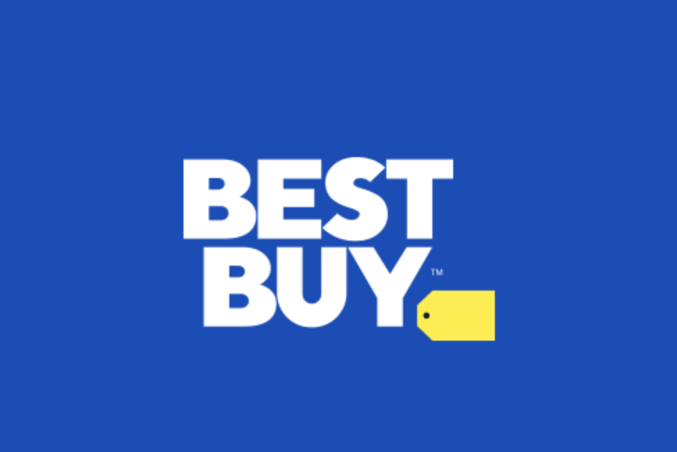
In 2018, Best Buy introduced a refreshed logo as part of a new branding strategy. The new logo replaced the old logo which was in use for more than 25 years. The updated logo removed the type from within the “tag” which gave the words Best Buy more room to breathe. The new logo featured updated colors and a new typeface. The iconic tag was kept alive as an element of the logo.
.

Your logo is not aligned with your marketing strategy
Often, the original logo a company develops serves in the early. However, as the company matures and its vision becomes clearer, the logo needs to be better aligned with the company’s strategy.
Instagram is a good example of this. While the company’s iconic logo was highly recognizable, it was at odds with its strategy. Here you had a red hot photography sharing app that was on the cutting edge of technology. Unfortunately, their logo projected a nostalgic and retro feel. This wasn’t strategically aligned with a modern, progressive app. They rebranded and developed a new logo that is now instantly recognizable and a much better fit.
Your logo is difficult to use across all marketing channels
Marketing has changed dramatically over the past few decades. With digital marketing, social media, and traditional marketing, there are more channels than ever to tell your brand story. Unfortunately, some logos can struggle to work within all the channels. When that’s the case, developing a more flexible logo can be beneficial.
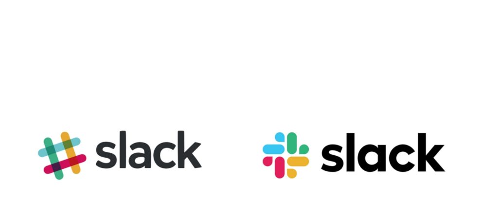
Slack burst on to the tech scene and quickly became the most talked-about technology product. While Slack had a nice logo, they found it wasn’t as flexible as they wanted. For example, the logo had more than 10 colors which meant it struggles when placed on color backgrounds. In 2019 Slack introduced a new logo that featured clean typography and a simpler color palette. It was an evolution that worked better while still capturing the spirit of the original.

Your company has merged or acquired new companies
Often when two companies merge, the logos are at odds with each other. For example, one logo may be simple and modern, while the other is complex and traditional. Try to force the two together and the end result is typically confusing and unappealing.
When mergers do occur, a more strategic approach is to take a step back and reassess how the logo fits in with the new, larger company. When Harris Bank was acquired by BMO, a new logo emerged. It retained the BMO mark and used it as a separator to clearly communicate the partnership between BMO and Harris Bank.
You are targeting new markets or expanding into new geographic areas
As you look at your logo, is there anything that is tying you to a particular market or geographic area? Are you now going outside of that geographic area or are you pursuing other markets? If this is the case, your logo may be too limiting and needs to be updated.
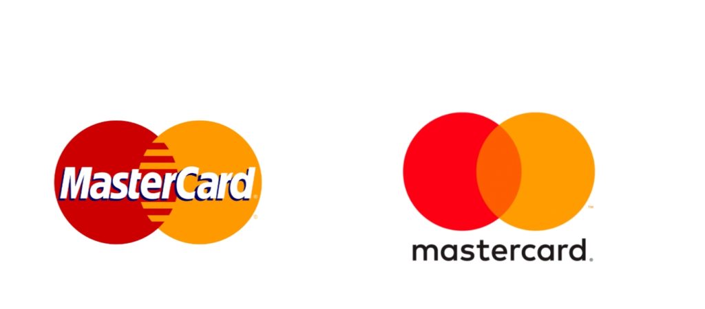
Mastercard believed the fast-changing digitally connected world was opening up huge opportunities for their company across the globe. In order to better connect in all countries, they redesigned their logo. The goal was to develop a Mastercard symbol that could be recognized easily no matter the language. The use of overlapping red and yellow circles became the symbol that transcends languages and cultures.
You need to stand out more in a competitive landscape
When everyone zigs, it’s good to zag. This applies to logos. If you look at your logo and it seems similar to so many others, it may be the time to make a change. By developing a fresh new logo, you can stand out in a crowded marketplace. This will help your company and brand become more recognizable and easier to remember in the eyes of potential customers.
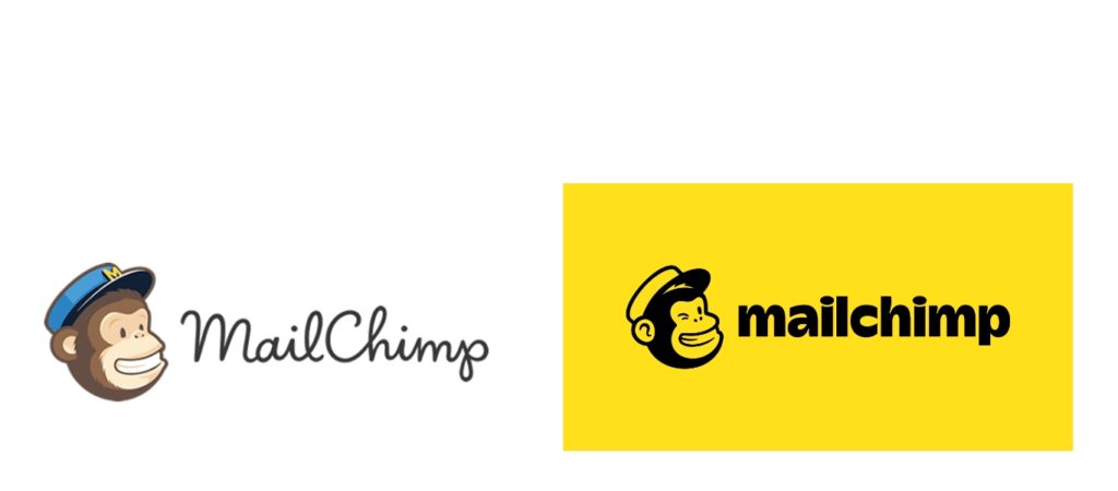
MailChimp is a well known email marketing company (which is similar to the one found in freeaffiliatemarketingbusiness.com). While their logo was actually quite nice, they recently went through a logo refinement. The new logo features a much stronger custom typeface and the use of a very bright yellow throughout their branding. The logo refinements and new branding are hard to miss and help MailChimp rise above all their competitors.
Your logo needs to work better on signage
If your business has a physical location and is dependent upon local consumers, signage is big part of capturing attention and getting foot traffic. This is especially true for retailers and restaurants. You can use Printmoz here for having on work for the right logo that works with your exterior and interior signage. The wrong logo can result in too many missed opportunities. You can look into affordable printing franchise cost, if you want to start your own business.
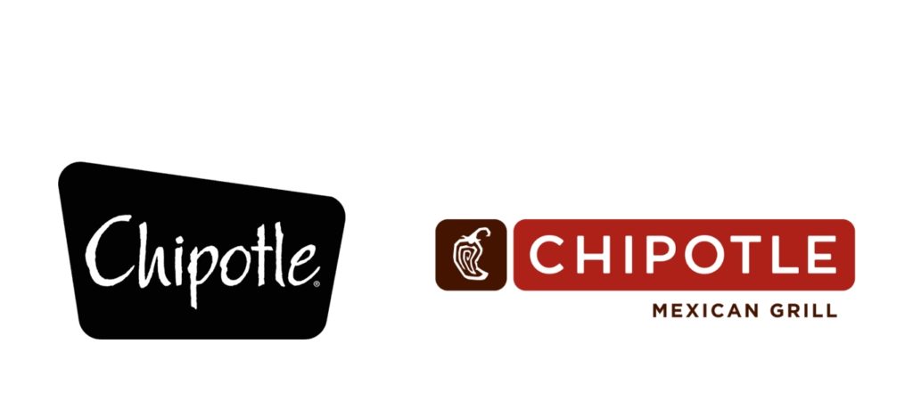
Chipotle is a great example of a company that changed its logo to work better with signage. Their old logo featured a script typeface. While it was a nice logo, the problem was it was hard to read when applied to a sign. Their new logo features an easy to read san serif typeface along with a chile pepper icon. It is so much easier to read especially when traveling at decent rate of speed.
Need a helping hand?
If you think it’s time to explore a change for your logo, let’s talk. Whether it’s an evolution or a revolution, we can help craft the perfect solution. Give us a shout or check out our identity page to review some of our favorite logos.